

The Platform
AO3 has multiple features that make it the most popular among the fanfiction pages. On the platform, signed up users can read and create stories, begin discussions, bookmark works and customize their own reading experience. With the filtering and exploring system, as well as the large amount of stories, the platform offers something for every user. It is supposed to be a collection of works the users can expand and add to.
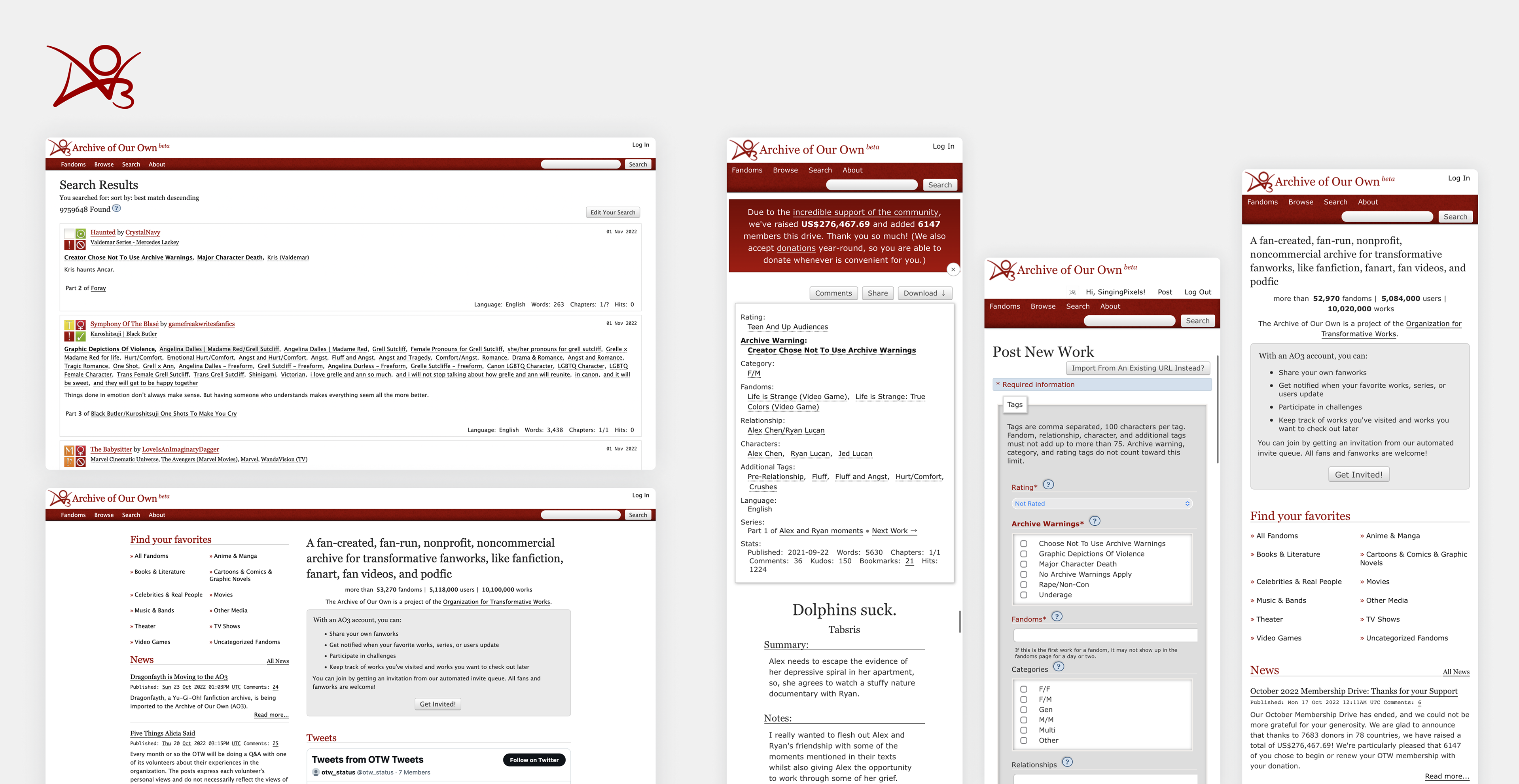
The current design of AO3 can be seen here:
The Problems
The concept of AO3 is great, but the execution and design of the website is outdated and very complicated for beginners to the platform. Before users get access to the content of a story they get overwhelmed with information that is often unnecessary, while important information, such as if a story is completed or not can easily be overlooked. The tags for important information like this are often vague or tricky to spot.
AO3 does not offer a mobile version and the formatting in the browser view is not optimized. The page utilizes outdated forms, panels and tagging systems that make the page seem overwhelming and disorganized. This should be improved to enhance the user experience and comfort during reading.
AO3 does not offer a mobile version and the formatting in the browser view is not optimized. The page utilizes outdated forms, panels and tagging systems that make the page seem overwhelming and disorganized. This should be improved to enhance the user experience and comfort during reading.
While the website does support customizable skins for a personalized look, the process of adding those skins is tedious and unnecessarily complicated. It requires either writing code for a custom design or searching online for skins created by other users. This process should be made easier and offer a dark mode version to the user that is accessible during reading.
The Solutions
To fix the issues AO3 is suffering from the following approaches can be made:
1. Simplifying the search method and filter options can prevent the user from becoming overwhelmed and get to their goal quicker. Story suggestions on the home screen can be presented, which are determined by the authors the user follows, the stories they have consumed and the tags they click on.
1. Simplifying the search method and filter options can prevent the user from becoming overwhelmed and get to their goal quicker. Story suggestions on the home screen can be presented, which are determined by the authors the user follows, the stories they have consumed and the tags they click on.
2. The reading experience can be enhanced by designing an interface without distractions and with easy navigation through the story's chapters. Users should be able to easily access comments, info and the dark mode from there. Additionally, highlighting text can be useful for making notes, as well as a system that memorizes in which part of the chapter the user has stopped reading to continue where they left off.
3. Application support for the large amount of mobile users is necessary to easily access their library on the go and prevent having multiple tabs of unread stories open in the phone's browser.
It is important to create a safe space for the user in which they can get lost in the stories and engage in the community of authors.
First Design Drafts
Below you will see the current drafts of the redesign. This includes a desktop version, mobile version, as well as dark & light mode. An integration into iOS 16 also improves the experience during reading with quick access to your music library and allows notifications for new chapter releases, hence I included a preview of this below.


iOS 16 Integration


